
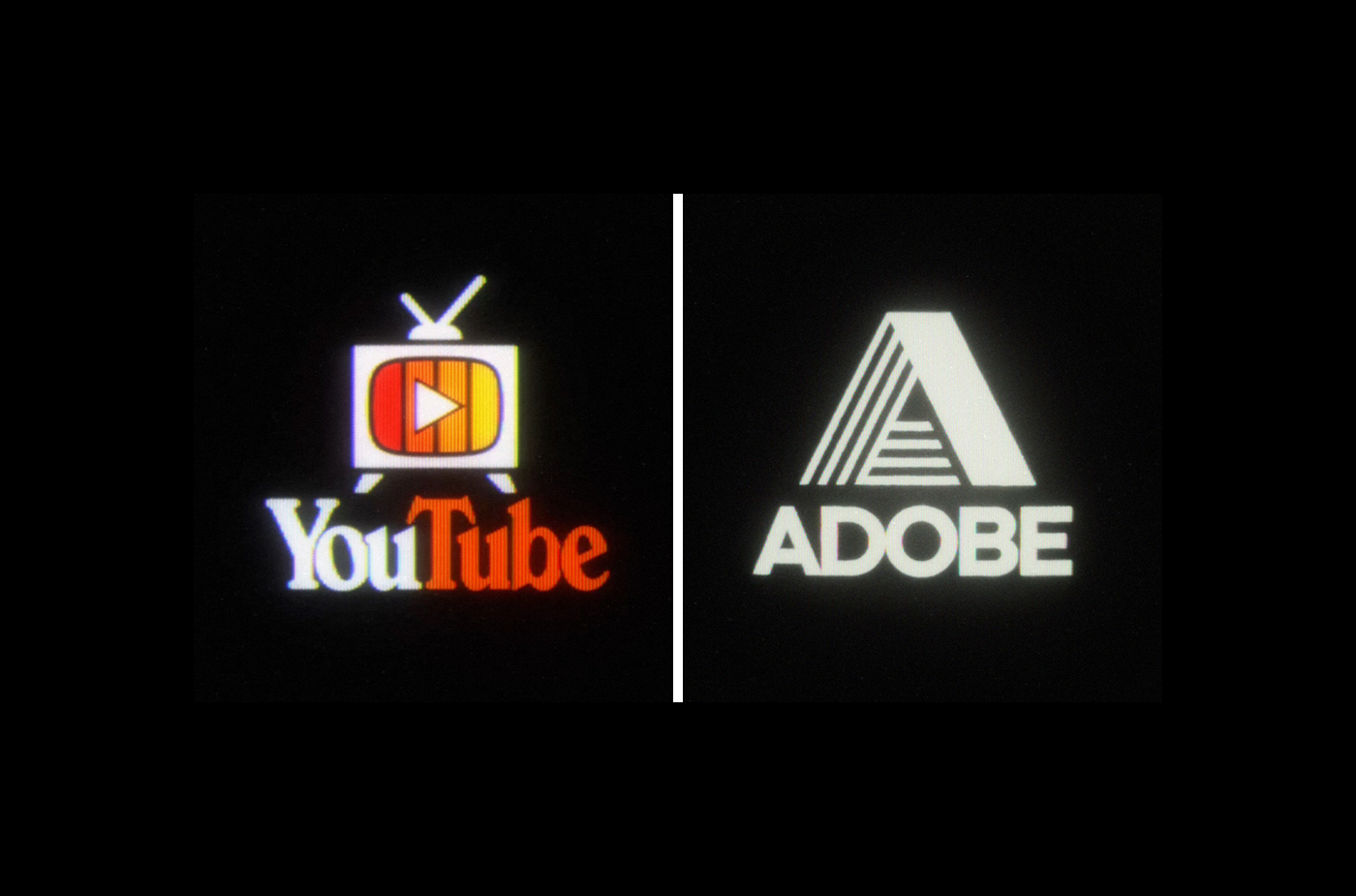
Back to the 80s logo designs
You must log in or # to comment.
A bit repetitive with all the logos that just have parallel lines of either slightly different colors or rainbows. Also, at least three of the companies (Polaroid, Microsoft and Pepsi) did exist in the 80s… The “redesigned” Pepsi logo is even almost identical to the actual logo that was used from 1973 to 1986.
But a few of them look really nice.
Also Adobe was around back in the 80s
deleted by creator
Love the glow look of a CRT. Too bad some of them don’t have the right font. Most are really good though. Googles is the most unrealistic, no one used smooth gradients like that back then.
Just trash from the playpen of a visual artist.
Logo design in a nutshell - if it doesn’t work in 1-bit it doesn’t work.



.svg)